Have you ever wondered why certain websites open differently on your mobile device vis-a-vis on other devices like laptops and desktops? Sometimes, this can hamper the user’s browsing experience, leading to high bounce rates and hence having an impact on sales. Therefore, every designer and developer must consider the responsiveness of their website design so that users across devices and browsers have a seamless experience.
While this may have many interconnected challenges, what you will read below is what will not only ease you into the concept of responsive design testing but will also give you a foolproof method to execute a successful mobile responsive website design process. Notwithstanding, the way that we access the internet has changed a lot over the years. Since smartphones have dominated the market, more and more people are making internet searches from their mobiles.

Today, it's worth mentioning that nearly 60% of all online searches come from smartphone users. This means that a mobile-responsive website design is now essential. Because of this, the priorities for good web design have changed. In other words, to empower a seamless and quality user experience, everything must be made to work on mobiles. This is called mobile-first web design, and is a standard that even Google now works to.
The mobile-responsive website design process helps webmasters deliver a seamless experience to their target users by testing across 3000+ real devices and browsers. This happens without compromising emulators or simulators.
Demystifying The Responsive Design Evolution Process
In the late 1990s, when browser wars were effectively reaching a (short-lived) end, most users had one browser (Internet Explorer) on one operating system (Microsoft Windows). They had one device (desktop) with screen sizes that were more or less consistent everywhere. Designing websites for these specifications didn’t involve abstracting differences between numerous browser engines, platforms, and devices—it could be done with components of static sizes.
Eventually, web developers began creating components whose dimensions were specified in percentages relative to the viewport. This approach allowed the components to be added to the browser window. This philosophy came to be known as ‘fluid design’. In 2010, Ethan Marcotte published an article in which he spoke of ‘Responsive Web Design’ in detail. The article discussed the variety of devices that readers used to access the web, which meant accounting for screen sizes, browsers, orientations, and modes of interaction while creating content for them. This article changed the way developers approached web design.
Towards the end of 2016, mobile browsing overtook web browsing. This further emphasized the importance of thinking mobile-first when it came to web development. Today, the market has over 9000 different mobile devices, with their own dimensions and graphics processing capabilities. Google prioritizes mobile-friendly websites in its search results. In 2019, you can not maximize your online reach without a responsive website.
What A Mobile Responsive Website Design Process Entails
Generally, responsive design is an approach where a website responds to or realigns itself as per the device it is being viewed on – whether it is a desktop monitor, a laptop, a tablet, or a mobile device. It is not just about visuals, but it also considers the fact that users have now started using ‘touch’ instead of the traditional mouse for clicking a button or selecting a sentence. Thus, responsive design has now started gaining importance since what may seem easy to click using a mouse may be difficult to select with a touch.
With the increasing usage of smartphones and the internet, responsive website design has become the need of the hour. Be that as it may, a mobile responsive website design is developing an application platform that is capable of adapting its content based on the device it is being viewed on. The layout and design of a website are generally created for desktop users. However, as the number of users who prefer to browse on a tablet or mobile phone grows, it’s essential for the web design to also become more versatile to ensure that all users have an equally positive experience.
A responsive design process allows a website to ‘adapt’ to various screen sizes. It frees you from the need to create and maintain separate versions of a single website.
As of January 2025, the Mobile market share is far greater than the desktop or tablet market shares combined. With over 62.71% of consumers using mobiles, it’s very important to ensure that the user experience remains consistent across different devices. This is why responsive design is highly important in today’s day and age. A mobile-responsive website design process entails designing a website so that a web application provides a good user experience across various devices.
Mobile Responsive design includes scaling the page components and content of the website according to the screen size of the device and reformatting the contents to be more user-friendly as the screen size is reduced. When a website is responsive, it means that it can easily and quickly adapt to any screen size. This means that the website will look and function correctly on a desktop, tablet, and mobile.
You can test if a website is responsive by going onto your desktop computer. Open up a site, then adjust the size of the window. A fully mobile-responsive site will adapt to the size that you make the window. It might look a bit different, but it will still be attractive and all the functions will still work.

Why A Mobile Responsive Website Design Is Important
Web applications are created to address existing user demand. Hence, it is important to understand the consumers and then create a product that caters to their needs for better retention. According to global statistics data, the mobile market share is 62.71% as of January 2025. On adding the tablet market share to this statistic, around 65% of the market share belongs to devices other than desktop devices.
If a product is unable to evolve and adapt, it will become extinct and will be replaced by other products that can meet consumer demands. On the same note, if a web application is not designed well and is unable to function and appear aesthetically pleasing on mobile and tablet devices, then it will alienate a significant portion of its potential consumer base.
There is also the problem of device fragmentation to consider. Other than the varying screen sizes of the tablet and mobile devices, there is also a multitude of device configurations with different browsers and OS. All of these factors need to be taken into account so that all users, regardless of the device they are browsing on, have a positive experience.
Therefore, when designing any web application, it’s very important to ensure that it’s mobile responsive. Generally speaking, there are various elements to consider while testing responsive designs. Below is a list of things a webmaster needs to focus on while they're testing the responsiveness of the website.
Consider some of these elements:
- Text, controls, and images must be aligned appropriately
- Hover and selection must have highlights and color changes
- Suitable clickable area must be present for touch-based devices
- Colors and gradients must be checked for consistency
- Padding around edges must be checked
- Images, text, controls and frames should not run into the boundaries of the screen
- Font size, style and color must be consistent for each type of text
- Data scrolls and displays must show up properly
- Pages should be readable on all resolutions
- Navigation should be simplified across web pages
- The horizontal bar on the page should be kept away
- The graphics used and the download speed must be kept in check to ensure content on different devices don’t break
At the same time, in order to better streamline your testing processes, BrowserStack has created a detailed mobile responsive design testing checklist to help all webmasters out there.
Why Webmasters Must Consider Google Mobile-First Indexing
In response to the huge uptick in mobile searches, mobile-responsive web design is now a ranking factor and affects Google indexing. This means that Google’s bots are indexing only the mobile versions of the whole web. If your website is mobile responsive, you can sit back and relax. Google will automatically crawl the mobile version without you needing to do anything. What happens when the website design isn’t mobile responsive?

Not optimising your website for mobile users is, to be blunt, a terrible idea. You’ll be missing out on the majority of searches, reducing your overall traffic and user engagement. Studies show that users are likely to abandon websites if they take longer than just 3 seconds to load. This gives you a very short window of opportunity to get your user’s attention. For large webpages to appease this tiny time frame, they sometimes turn to AMPs.
What Are Accelerated Mobile Pages (AMPs)? Are They Good For SEO?
In this case, the Accelerated Mobile Pages (AMPs) are webpages designed for speedy loading to meet the demands of mobile users. They only deliver the bare bones of a page, so no time is wasted loading extra features that aren’t essential to the page’s experience.
Google can serve cached copies of AMP pages, which means that the link can load as fast as possible. There are a couple of drawbacks to this. The cached versions of your AMP pages are hosted on Google’s servers, so if you want to track conversions, this won’t benefit you.
AMPs are most successfully used for news-type content, where users will want to read text without waiting for the rest of the site to load. If you have a business website where you want users to learn about your brand identity, you’re probably better off with a responsive website. This allows you to be more creative with your web design and express your business through images, colours, and features that AMPs don’t support. So, are AMP Pages good for SEO?

On the one hand, AMP Pages are not as essential for SEO as most webmasters may think. Of course, they have their uses, but you shouldn’t consider them to be part of your SEO strategy. On the other hand, although AMP Pages are faster to load, they aren’t considered to be the best practice for SEO.
However, fast loading time is a ranking factor. So, to increase your website’s ranking and visibility, you should put your efforts into optimising your standard website with high-quality content and fast loading speeds.
When You Must Consider A Mobile Responsive Website Design
Before embarking on any mobile-responsive website design project, take a look at your target market and audience. The aim is to find out how your users access the web. Look at your website’s traffic analytics and combine the insights with the test on the right devices report to find out the top ten browsers/devices in your target market.
What are the website’s ‘core’ features: These must render uniformly across browsers/devices. Everything else can be improved upon in later iterations. Let’s be clear: if your competitors have mobile responsive website design and you don’t, you are very unlikely to outrank them. This can have a devastating impact on your business, leaving you with fewer users and less website traffic.
Don’t get left behind! Invest in a site that’s fully mobile responsive to ensure that your website can be found online by anyone. When creating a mobile-responsive website, the general layout of the website and its content both need to be transformed in order to reproduce the desktop experience on a smaller screen.
To create a mobile-responsive website, there needs to be a plan in place from the get-go. While designing the website, research and take into consideration the requirements to create a responsive web application. Sketch out the layouts for the site, addressing the differences in screen sizes between different devices.
The topmost best practices:
- Ensure that the content is readable. The font and size of the text shouldn’t make the user have to squint to read and understand what is being conveyed.
- Make the design compact and prioritize the content that will draw the user’s attention.
- Keep in mind the small screen size, and design the page so that it is functional for a compact touch screen. Difficult-to-click buttons often leave the user feeling annoyed. Therefore, design the page with spaced-out and easily clickable buttons.
- Make the interactable elements easy to reach. People use their thumbs when interacting with websites on their phones. It is vital to keep this in mind while sketching out the layout of the web application.
- Make Images responsive and adjust the size of images depending on the screen size. Prioritize images vital to catching the user’s attention.
- Use WebP or SVG images so that the image quality isn’t compromised while resizing.
- Make the design minimalistic.
Additionally, take the style and formatting into consideration. Lastly, think through possible issues that may surface at a later time regarding responsiveness and try to preemptively address these issues early in the design process. One of the most essential factors when designing a website to be more mobile-responsive is pondering over what a potential user would want from the web application.
For example, Mobile users are often very impatient and want the content to load quickly. This makes them prone to abandoning a website if it takes too long to load, while desktop users are more likely to wait. This means that a fast loading time would be beneficial when creating a mobile-responsive web application.
The Most Essential Mobile Responsive Website Design Features
As mentioned, responsive design enables a website to scale its content and related page components automatically across different devices like mobiles, tablets, and desktops. This enhances the user experience, no matter what device they are using. This results in better conversions and eventually builds positive perceptions of the website and its brand. Hence, ensuring the website design is responsive and conducting responsive design tests is critical.
Mobile users are impatient and are quick to switch from website to website in search of entertainment. Therefore, when trying to create a responsive web application, the developers should attempt to make the website light so that it loads quickly and smoothly. First impressions are important, and a fast-loading website will help make the user have a more favorable view of the application.
Mobile users will frequently switch between landscape and vertical views as they look at web content. The switch between views can result in missing images or issues regarding functionality, which could frustrate users. It would be best to ensure that the website’s content and layout are not butchered when a user switches views. For a mobile-responsive website design, there are other core features that you should consider:
Layout Viewport
The first step is to define a meta viewport tag that tells the browser how to scale and size the content while rendering the page. All the information you want to convey in the meta tag will go into the content attribute. Without the viewport meta tag, a mobile browser will render a page with the dimensions and scale of the desktop version. The viewport meta tag is defined as follows:
In addition to the initial-scale setting above, you will have to define minimum-scale and maximum-scale to set the minimum and maximum scaling of content. Once a viewport is defined, you need to modify the elements on your page to fit the viewport. Keep in mind that users expect to scroll vertically and not horizontally.
CSS Media Queries
While resizing the elements of your page, make sure to not assign fixed widths to any element. Relevant content also needs to render in the appropriate order. This is possible when different properties are associated with the same DOM element, depending on the device on which the page is rendered. CSS media queries enable you to do this.
CSS introduced media queries in CSS3. Media queries allow your page to adapt to the viewport. For example, if you have these criteria:
- When the device width is less than 640px, the font size is 15pt.
- When the device width is less than 480px, the font size is 12pt.
You can modify your CSS to do this using the media attribute: Option A can load a stylesheet based on the width of the device. This can be achieved in the link tag through the media attribute. In this case, the browser will use the stylesheet.css file only if the screen and device widths are lower than or equal to 640 pixels.
Additionally, you can use the @media keyword in CSS3 to associate specific CSS properties based on screen-based filters. This feature is helpful if you do not wish to create separate files for different screen sizes. You can also execute media queries based on the orientation of a device using orientation. The orientation attribute is not supported by all devices. That’s why developers use a combination of max-device-width and min-device-width instead.
Text Optimization
Text size can be denoted in absolute terms using px or pt, or in relative terms using em, rem, or percentage. You can put the text properties within media queries for different viewport dimensions. Some important considerations:
- How many words should there be in a single line, for the smallest device?
- What is the smallest legible text size for a specific scale and viewport?
Responsive Images
You can make an image ‘fluid’ by linking the width of the image to the width of the container DOM element. This ensures that the image can resize according to the width of the container element as required—this is something which itself can change based on the viewport. Once you have placed an img tag within a container tag, size the images as follows:
Keep in mind that this approach has a significant performance overhead, especially on mobile devices. About half the payload of an average web page is because of images. Optimizing your images for a mobile device context can help improve latency. Alternatively, you can write a back-end script that displays the best image file to serve based on device and network capabilities.
Navigation Menus & Readability Elements
There are two popular ways to make navigation menus responsive:
- Convert navigation links to a drop-down menu
- Create a hidden menu that is visible only through a swipe/click.
Image And Button Formatting
Similar to the other contents of a webpage, it’s important to ensure that buttons are visible and accessible to the user. It can be very frustrating trying to click a tiny and badly formatted login next item/page button. Users can often give up on using the website altogether out of annoyance at out-of-place buttons. Therefore, developers should make large, visible, and easy-to-click buttons when designing a mobile-responsive website.
Data Tables
When your table contains too many columns to fit smaller viewports, users are forced to scroll horizontally. One solution is to convert each row into an element and make it responsive. This way, each row is displayed through multiple lines on smaller devices. Another approach is to hide some columns in smaller screens and provide a button that displays the other columns when the user clicks it (by adding a horizontal scroll, but with the user’s consent).
The Right Testing Methods For Website Mobile Responsiveness
Since website speed is an essential feature here, you may need to test if your website design is light enough to have a faster loading time. This will help improve the overall mobile experience. During the development of a website, it would be prudent to check whether the website is behaving as predicted across different devices. To test mobile responsiveness across different device/browser combinations, tools such as the responsive tool by BrowserStack can be highly useful.
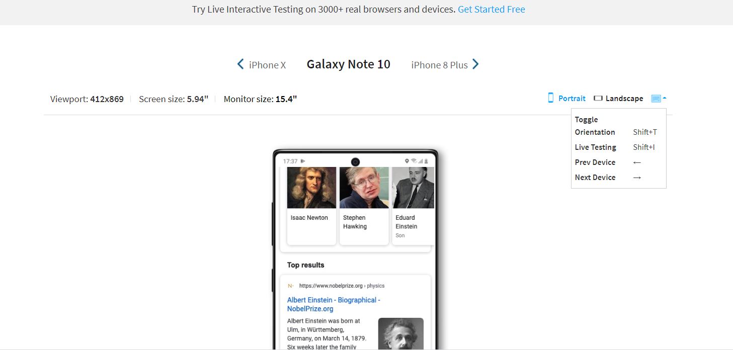
Technically, the BrowserStack Responsive Checker Tool offers interactive testing across 3500+ real browsers and devices. In essence, a responsive checker tool aids in the user’s testing of responsive web design. The tool enables the user to check whether a website is being shown correctly across a variety of platforms. This entails considering a wide range of screen sizes, device configurations, and additional elements. Before deployment, it is imperative to check whether the website is responsive and functional across a variety of devices using a responsive tester tool.
Although testing the application on a variety of devices is important, depending on the application in question, it could be unnecessarily exhaustive to test it on 3500+ device/browser combinations. Developers can make Mobile responsiveness testing more efficient by testing on the right devices.
So, how to identify the right mobile devices to consider in your responsive design project? If the application has already been released to the public, then data can be collected regarding user devices, and the devices on which the application is most frequently used can be identified. However, survivorship bias could occur if this method is used.
How Webmasters Can Utilize A Responsive Checker Tool
The best devices to test a particular website depend on its geographical market and its targeted customer base. Some of the most popular devices to test on include iPhone 8, Samsung Galaxy S8, Google Pixel, and Nexus 7. These are available in BrowserStack Live. However, this may not always be the case because of the factors mentioned above.
To gain a detailed understanding of which mobile devices to test on, read the test on the right mobile devices analysis. You may also sign up and get started with interactive cross-browser testing if you are a webmaster. A responsive checker tool basically helps the user test responsive web design. It allows the user to verify if a website is being displayed properly across a wide range of devices, both desktop and mobile.
Usually, a Responsive Checker Tool is essential as it ensures that a website provides the optimal user experience across as many devices as possible. This means taking into account a large variety of screen sizes, device configurations, and other factors that have become a major concern due to device fragmentation. Ideally, every website must be verified with a responsive tester tool.
A responsive checker tool allows a user to instantly test a website for responsiveness across various devices just by entering the website’s URL in the designated space. A user can perform mobile responsive tests across multiple devices, like iPhone 6, Nexus 4, and many more. This responsive design checker is not limited to just mobile devices. Users can also perform tests on multiple desktops and tablets.
How to run a responsive test online.
- Use the BrowserStack Checker Tool if you're a webmaster
- Enter the URL of the website that is being tested.
- Click Check, and you will be taken to the Sign Up Page, where you also have the option to sign in.
- Once you sign in, you can enter the website URL and click Check to test responsiveness.
- When a particular device is selected, the user will get a view of what the site looks like on it.
Once a website renders as desired across all the devices and the user is satisfied with the website's performance, then it can be declared as a successful responsive test. However, please note that each of their free testing plan allows a maximum of 100 responsive checks. As such, you can upgrade your plan to receive unlimited access to the responsive checker tool.
Seamlessly integrate BrowserStack into your setup. They often work with the tools and frameworks you use frequently. Test development code from Visual Studio and non-production apps from Firebase. Run automated tests on every commit from your CI/CD pipeline, and get test results directly in Jenkins and Slack. Report bugs directly to Jira, and reproduce them with a click.
The responsive BrowserStack tool lets you quickly test your (publicly or locally hosted) responsive websites on real mobile devices. For a few pages, you can get started with the Live Interactive Testing Tool for free in your next mobile-responsive website design project.
Getting Started With The Right Responsive Testing Toolkits
For unreleased applications, a reference application can be utilized, and an estimate of what the target audience looks like can be obtained. Unfortunately, it can be difficult to obtain such data, and in many cases, there are very few applications that can act as a reference. The best method to ensure that there is sufficient device coverage for a web application is to utilize market data. Websites such as statista.com and https://gs.statcounter.com/ provide extensive data regarding device popularity, browser popularity, and various other relevant statistics.
Market data is unbiased, and there’s often a large pool of it available. Additionally, the data is frequently updated and provides an almost real-time perspective. This makes market data one of the most relevant sources of information when attempting to test mobile responsiveness across various device/browser combinations, since it can be used to quickly identify the most popular combinations at a given moment in time.
By ensuring that the application is responsive to these popular combinations, the developers can be assured that the majority of their user base is covered. Now that you understand the basics of responsive design, let’s see how it translates to practice today with the right pre-designed templates. You can quickly start building a responsive website using a CSS3 library called Bootstrap and extending a pre-designed template.
Bootstrap
Bootstrap is a framework that contains HTML, CSS, and JavaScript libraries. It enforces a mobile-first approach and lets you create a responsive website quickly. To use Bootstrap in your project, import the Bootstrap CSS and JS files. Bootstrap’s JavaScript functionalities have a dependency on jQuery. Before importing Bootstrap’s JS files, import jQuery:
Bootstrap provides a starter template, complete with a viewport tag. The basic premise of Bootstrap’s design is a 12-grid layout that a developer can use while defining DOM elements. These columns are available across screen sizes and define relative widths.
Images in Bootstrap can be scaled to the parent element using the img-fluid class. Screen-specific images can be rendered using the picture HTML element. Data tables in Bootstrap need horizontal scrolling. To adapt them, use the .table-responsive class with the .table class to make tables responsive.
Pre-Designed Responsive Templates
Responsive templates allow non-designers to modify existing templates with custom styles. This lets you create entire websites with zero design experience. The GUI at Wix is a popular option that lets you browse through themes and edit them. W3Schools is another resource that provides themes in various color palettes that you can use and modify.
As you can see, it’s pretty easy to create a responsive website. The real challenge is making sure it actually resizes and rescales to fit viewports across browsers and devices. That’s where responsive design testing comes in. Once you have successfully created a responsive website, you need to test to make sure it can:
- Display and align the content consistently.
- Render text legibly on all scales and viewports.
- Keep content (text and images) within their containers.
- Display and resize images as needed.
- Allow users to scroll vertically (or horizontally, as in the case of responsive data tables).
- Let users navigate via links and menus on all devices.
- Scale/resize content based on portrait or landscape orientations in mobile devices.
In a responsive test, start by manually testing the website on various viewport sizes to check if the content scales to fit correctly. To find inconsistencies in colors, fonts, illustrations, etc., you will need to do a mobile-responsive test using real mobile devices. There are some responsive design testing tools you can use, including the following:
Chrome Developer Tools
The Chrome Developer Tools is the go-to toolkit for developers to test and debug responsive websites. The tool simulates a range of mobile screen sizes and orientations to help you see how the layout and elements adapt to different viewports, find and fix errors quickly, and see the changes in real-time.
DesignModo
Instead of pre-defined screen widths, Responsive Test lets you assess your design on different screen widths for a ‘true’ test of ‘adaptivity’. Once you enter the website URL, inside the DesignModo, you can change the width of the screen to see how your UI ‘adapts’ to fit it in real-time. You can switch the orientation and jump to popular device sizes from the menu.
For your information, cross-browser testing a responsive design by resizing a browser window is okay, but it doesn’t really tell you how your website will actually look on real devices. Consider this: Some fonts render more ‘weighty’ on Chrome than on Safari. There are also device-and platform-specific differences that affect rendering, like anti-aliasing (aka smoothing) and screen resolution.
Summary Thoughts:
As you can see, a mobile-responsive website design is a very essential process for webmasters. Typically, a responsive design process lets any given website ‘adapt’ to different screen sizes without compromising usability and user experience. Text, UI elements, and images rescale and resize depending on the viewport.
Responsive design allows developers to write a single set of HTML, CSS, and JavaScript code for multiple devices, platforms, and browsers. Responsive design is device-agnostic and aligns with the popular development philosophy of Don’t Repeat Yourself (DRY).
But there’s more to it than that. It can be challenging to make an existing site responsive, but the benefits of investing in responsive design early on in a project far outweigh the effort required to achieve it. Notwithstanding, there are multiple ways to test a website on mobile.
Consider the following:
- Using an emulator to replicate the target device’s hardware and software on the tester’s desktop. However, emulators are held back by multiple limitations, which prevent any tests run on them from offering conclusive results.
- Testing websites on real mobile devices that have mobile browsers and operating systems installed on them. This can be achieved through an on-premise device lab (one constantly updated with the newest devices) or a testing platform providing cloud-based access to real mobile devices.
Overall, you can use the BrowserStack’s Free Responsive Checker to instantly check how a website renders across popular devices like iPhone X, Galaxy S9 Plus, and more. Please check out The Ultimate Responsive Design Testing Checklist for more details.